As UX is a human centred field, UX designers need to understand human psychology. You’d be reckless to ignore how the mind works when planning your design. After all, to succeed in UX is to bond psychology, technology, and art in one product.
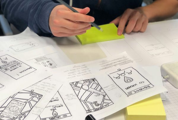
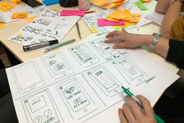
I’ll share the few common rules that will elevate your product design. The senior designers worth their salt will have these rules ingrained in them that it becomes second nature for them in the design process. For newly minted designers, it is useful to refer to these rules when they’re bombarded with too much data, and have lost sight of the product or project.
1. We always choose the easiest way out
This one applies to beyond UX, in other fields such as marketing, advertising and education. This rule simply says that your users will always use the easiest way to achieve something – the path of least resistant. And if it takes too much time and effort, then they are less likely to do it or complete the task.
It’s critical to keep this in mind. It sounds a simple enough rule, but many forget this as they go deeper and deeper in the design, and end up with a complex product. As Leonardo da Vinci said,
”Simplicity is the ultimate sophistication.
2. We are habitual creatures
We switch to autopilot a lot. Our brain does a lot of work when we’re awake, so it’s always trying to simplify things by creating habits. Habits are automatic actions so you can spend your time on other cognitive-heavy activities.
You must be mindful of the people you’re designing for and their habits. One example is the morning routine. Most people tend to check on the news, weather, and their calendars to start the day. AI assistants, like Siri and Google, will brief you on this information first thing in the morning. And if designed right, your product can instil positive habits in your users, until it becomes natural for them to ask every morning, “Hey, Google, good morning. Tell me about my day.”
In the world of retail, people like to window shop and compare before buying. That’s why you have a wish list feature on ecommerce sites to help people keep items they like aside, before committing to purchase.
3. We take longer to decide the more choices we get. (Hick’s Law)
The more decisions your users must make, the more confused or frustrated they could get. At some point, the cognitive load will be too much, and they will leave your site for something else.
It’s essential to think about what you’re presenting to the user at each step of the process. If they are constantly wondering where to go next or if they are taking the right steps, then you’ve just designed something difficult for them.
If you think about McDonalds and KFC, one of the reasons, perhaps, for their enduring popularity is because the core menu has never changed. When you’re tired and hungry, you don’t have to think about what to order. There’s always going to be a Big Mac at McDonalds and a dinner plate at KFC.
4. We can’t hold too much in our brain at one time. (Miller’s Law)
Miller’s Law says that the short-term memory can hold up to 7 items at a time, give or take 2 items. This isn’t a fixed rule where it must always be 7 items on the screen, or else you’ll lose your users. But the general principle should drive your design to think about the things you are putting in each screen. If there are too many things, you should group them or present them in the next step of the process.
5. We are drawn to contrasts. (The Von Restorff Effect)
The Von Restorff effect posits that we are always drawn to the item that is most contrasting among a group of similar items. This is useful in highlighting call-to-actions, promotions, and critical updates for your users. However, be careful that you’re not designing too many contrasts that it just renders them useless and overwhelms your users.
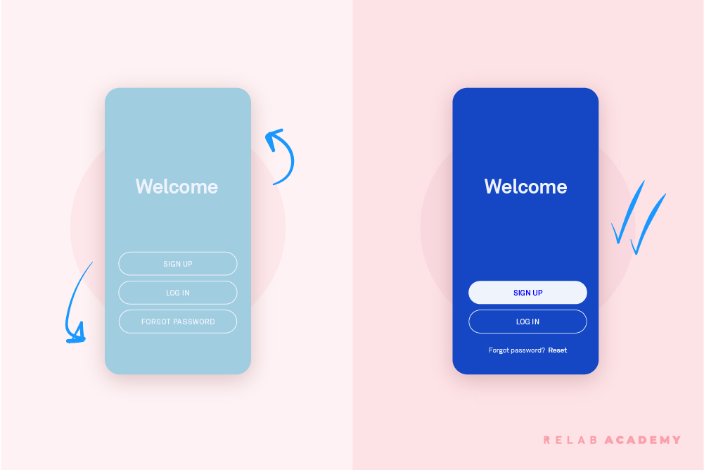
6. We crave for what’s familiar. (Jakob’s Law)
Users expect to have the same familiar process or experience as to how it’s always been done. It’s always tempting to reinvent the wheel, but you shouldn’t go all out to redesign the purchasing process on your site. If users expect a confirmation page or pop-up after paying, don’t scrap it to give them a page full of your latest offers instead. It will dampen their shopping experience with you.
7. We lose interest if we can’t understand something in seconds. (5-second test)
This is a common-sense rule, but something product designers tend to forget when they are juggling too many requirements. If your users can’t understand a page within 5-10 seconds, they will leave your product. In usability testing, we will briefly show participants a homepage, prototype, or copy. Then, we will ask them whether they understood what it was and their impression of the design. It’s a sure-fire way to know whether your design is on the right track.
There are more psychology-based rules and studies that will help you become a better designer. I’ve only outlined the 7 most basic ones here. Hopefully, you will start to see your design process in a different light.